Today in Australia we vote for who we wish to be our next Prime Minister.
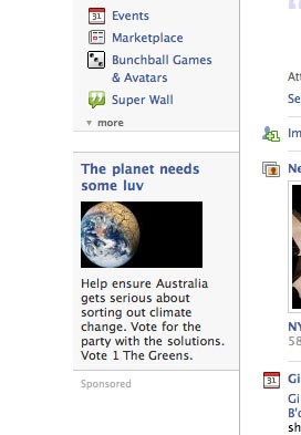
Following on from Tobie's post below, this year is the first time the Internet has played such a big role in the campaigning of the major political parties.
It's interesting to see the difference between the two candidates, and how they've embraced YouTube, Facebook and even MySpace.
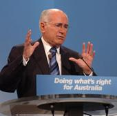
John Howard (Liberal) made some attempts at spreading his message on the YouTube, but didn't seem to grasp the medium too well. He was often addressing his audience as though it was a specific time or place, saying "Good Morning".
Kevin Rudd (Labor) at least achieved some notoriety with his footage of picking a piece of earwax out and eating it.
The polls favor a Labor victory, but without getting into the policies, I took my own mini poll by assessing a few characteristics of their online campaigns...
Homepage Design
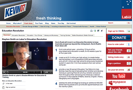
Kevin Rudd (Labor) has used a fresh color palette to go with his "Fresh Ideas" mantra, shown a full embrace of the social-networking tools available to him, and allows for the page's text size to be increased.

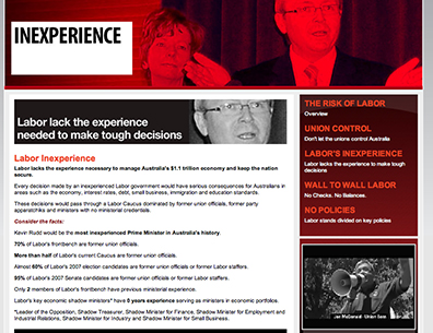
John Howard (Liberal) however, has used a not so appealing "Infra Red" style effect and has disobeyed classic Jakob Neilsen advice in going with a red text on red background motif.

MySpace Design
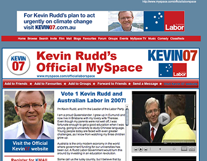
Rudd (Labor) has forked out the dough for a custom template which aligns nicely.

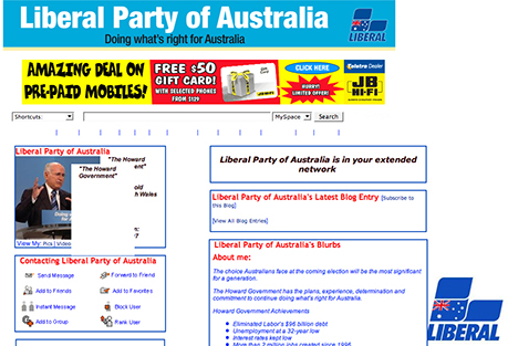
Whilst Howard (Liberal) has gone with your stock standard MySpace ugliness.

MySpace Friends
Kevin Rudd (Labor) - 23,602
John Howard (Liberal) - 9
Facebook "Fans"
Kevin Rudd - 20,130
John Howard - 121
W3C Code Validation errors
Neither campaign sites validate completely, but Labor has the least validation errors with 23, versus a whopping 122 from the Liberals.
Use of photography
Kevin Rudd appears to have borrowed heavily from the stock photo category for the keywords "smooth + businessman".

I wonder if "Rebecca" below, would be disappointed in real life if Kevin and her met after cyber-dating?

Whilst John Howard has used a poorly compressed JPEG at tiny thumbnail size, and not a very inspiring pose.

All adds up to a pretty shoddy effort from the Liberals.
VERDICT: LABOR TO WIN
In all seriousness though, Labor's campaign does seem that little bit more progressive in their understanding of the web, and that is obviously a big issue in terms of Education and Innovation. Their policies also include improving Australia's woeful standing in broadband uptake too.
Generally speaking, the Labor Party appeals to a younger demographic, whilst the average Liberal voter is probably a bit older. But Labor still seems miles ahead.
In about nine hours we'll see what the real outcome is!
