The more we digitize our lives the easier it is to visualize all the data we produce. Take your music taste for instance. Previously when someone asked what music do you like you'd have to think on the spot. Now thanks to services like Last.FM I can rattle off my top 10 musical artists.
The same goes for video games and Xbox Live. I can claim to be a gamer but checking my gamer tag will reveal that I've hardly finished any games and play infrequenstly.
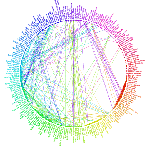
I can visualize my friends thanks to Facebook's Friend Wheel app.
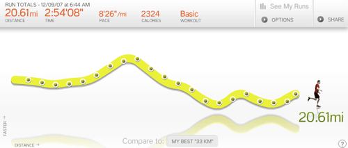
I can visualize my exercise thanks to Nike+. Well make that I could if I did any or owned a pair of Nikes. Here's someone elses. But if I did take up running I'd only do it with Nike+ as I'd hate to not get the data.
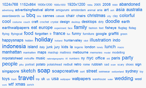
I can visualize my photo taking habits on Flickr.
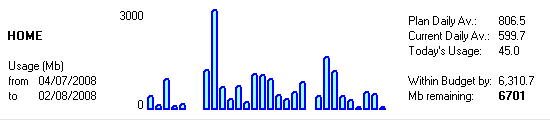
My broadband at home is graphed.
Sites are popping up all over the place to help you visualize your personal data and social networks.
Take a look at Fidgit and Last Graph and Xobni. I've probably missed another 50.
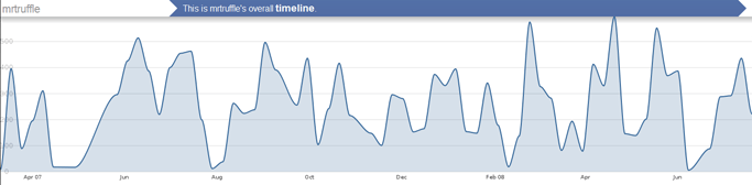
Here's my music listening trends from my Ipod and Itunes for the last year. You can see where I've been on holidays with the dips.
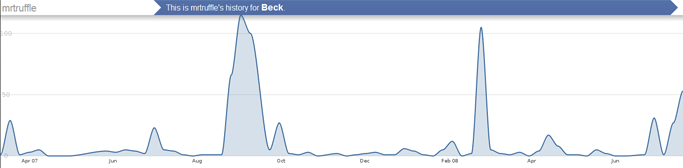
If someone asked me who my favourite musical artist was I would not have said Beck but it seems he is by a long shot. Here's my Beck listening graphed.
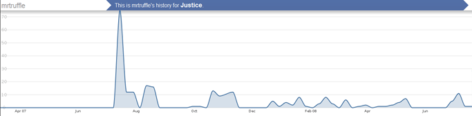
And what about newcomers like Justice (I run a music blog too and I've expanded my musical tastes ten fold lately.
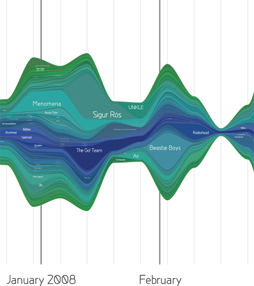
You can even get your tunes as a poster. Here's a crop of what you get.
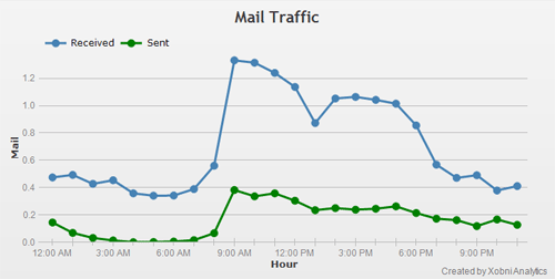
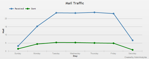
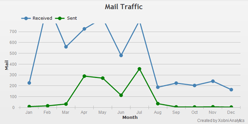
Here's my email visualized thanks to Xobni. I send more emails at 10pm than I do at 9pm. Weird
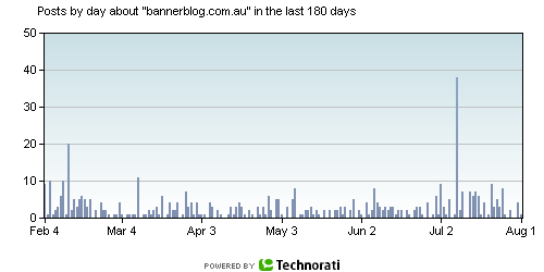
I can track my infuence on Technorati and visualize the incoming links to the blog. Sadly my influence is dropping while traffic is increasing. Go figure.
What about brands?
How long before other markets start to bring this form of visualization into their products and normal life.
Imagine an airline that visualized your flight history with them,
- A fast food chain that tracked your consumption and presented you with a certificate to congratulate your 100th burger.
- A bar that tracked every drink you consumed.
- A car that displayed your driving habits, urban vs rural, miles per day, week and month, mpg etc etc. Then when you go to buy a new car you can use that data to choose a car that's right for you.
- Why doesn't my mobile phone bill look more interesting? Imagine your bill that charted your location and time of day you talk in a sexy graph. I'd be able to make more informed decisions on if I talk off peak or not.
- A condom manufacturer that tracked your sexual activity.
This one has already been done, without a brand.
Bed Posted keeps track of your sexual activity. It's dying for a brand to own this space. (lynx? Or a condom manufacturer) The data alone would be worth a lot to the product teams. Track this app's dev on
Twitter.
Pretty much everything in your life generates data. And the more data you have the more informed your decisions can be. For brands gathering this data from users is a valuable business tool.
Amazon knew this and that's why their suggestion engine is so powerful. Nike now knows your running habits and can recommend a new pair of shoes to you after you've done a few hundred miles.
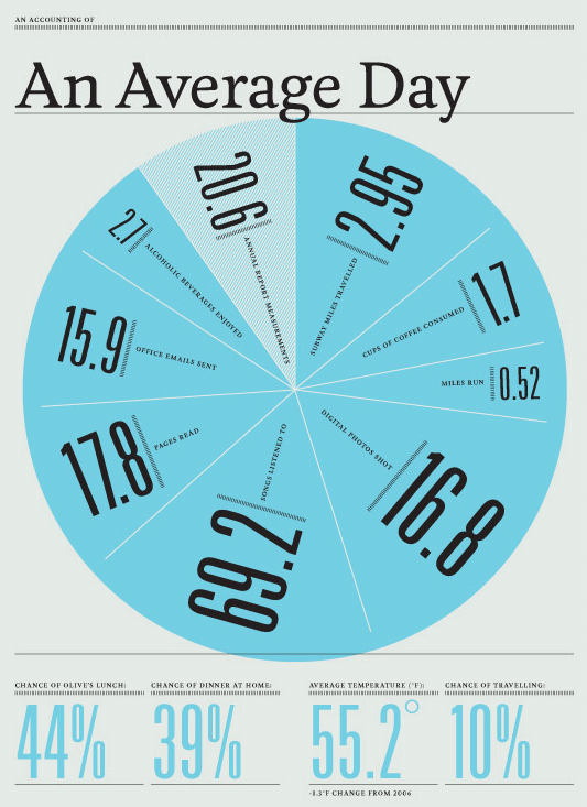
One graphic designer has been charting his life for the last 3 years and produces annual reports based on his life. Beautifully designed and insightful. See 2007 here. The printed version is quite nice.
What else in life or what brand could be enhanced with data visualization?