Banner Blog: Where banners click
We're looking for a sponsor or advertisers
AboutIndustry NewsSubmitArchives and RSSSubscribeContactFollow us on TwitterJoin us on Facebook
« March 2008 | Main | Archives | May 2008 »

April 28, 2008

Nice copy spotted recently

I don't think this is so much of a site launch, as a site I've just noticed.

Help is a pharmaceuticals company with a trendy little site. Kinda like if Nudie/Innocent took over Panadol.

I reckon the web is more in need of better writing than design. And Help delivers. Especially for a company that sells something so un-web2.0 as headache tablets:

Extract from the website:

Coatings and dyes can make a pill look prettier but they don’t really help you with your headache, and that’s what we are trying to do. If you enjoy coatings and dyes, you will have to eat them separately.

Thank you. You have given me relief from my headache without adding to my pain by making me read your overly verbose T's and C's or look at heavily-flared photoshop designed packets.

Nice.


April 23, 2008

Where's Wally/Waldo Web 2.0

This is fantastic, and silly, and not an ad.

A chick in Vancouver has painted a giant mural of Wally from 'Where's Wally?' (or 'Where's Waldo?' if you're in America), and has invited people around the world to find him using Google Maps.

waldo.jpg

Read about it here


April 15, 2008

White Gold

It wasn't until I saw the milk filled Guitar that I knew I liked the White Gold campaign.

The website has more content than I can comprehend and produced to a level that must have required serious investment.


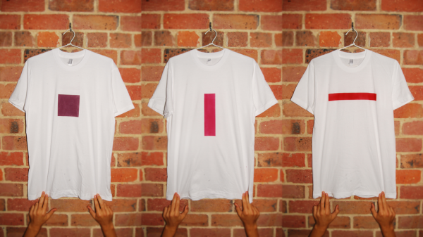
Banner Spec Tees

I should probably wear these at Cannes. More info here

728_tees1.thumbnail.png


Dunlop Volleys

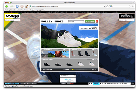
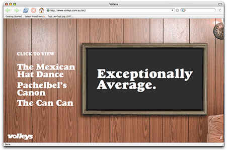
The site for the new Dunlop Volleys campaign is the first one in a while where I've actually taken the URL from a poster, and actually visited it. Hey, the system does work!

dunlop0.gif

I've always liked volleys. They're a real basic sweet shoe you can't go wrong with. If you're a kid at school, your mum can buy them at Big W but you still won't get bashed up for it. And if you're an indie inner city skater, you can also wear them without fear of sneaker snobbery.

dunlop1.gif

dunlop3.gif

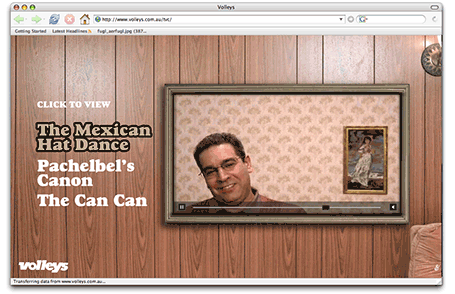
They've based the whole campaign on a middle aged guy in a knit sweater playing the tunes of classic songs, by making fart noises with his hands (you can't get much more un-snobbery than that eh?). Ending with one of the best taglines I've seen since the 60s: "Volleys - Exceptionally Average".

I like their site too. Nothing amazing about it. But it works, is unoffensive. And is worth a look. Straight into it without any fuss.

Just like the shoes, I spose.

Lovely work (posters, TVC and microsite) from the good guys at Marilyn & Sons.

< /end blatant attempt to score a free pair of dunlop volleys>


 1  |  2 
Next Page