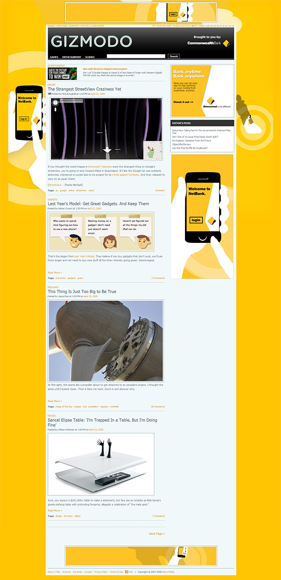
One element of online advertising we at Bannerblog have neglected covering for a while is the "creative media" side. Below are many examples of where the media placement is just as important as the creative itself. In some case it's more important.
The next time you are planning an online campaign make sure some real thought has gone into the media side. No more ROS and no more template media buys based on what ever gets you the best deal.
These examples go beyond contextual advertising and are the few times media agencies can hang their heads high in creative circles.
If you have an example of where media and creative have made sweet advertising love please submit them to us. We'll either update this post or do a follow up. |
 |
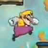
Nintendo: Wario Youtube Experience: View
The fact that this was on a Youtube URL and not a different site was the main reason for the effectiveness. You couldn't have been more surprised. A top notch execution together with an interesting game is a recipe for success.
|
| |
 |
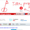
Sol Comments: View
A personal favorite and Cannes Grand Prix winner this campaign showed that a banner ad doesn't have to be static content. It's easy to pass over until you realize the true genius of this campaign and how it could only be done with online media. The media placement was an important part of the campaign as a team kept an eye over the site and updated the banners live to reflect the content on the page.
|
| |
 |
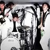
Axion: Banner Concerts: view 1, View 2, View Article
A campaign that uses the media space - a banner - to promote unsigned bands with a live / streamed performance. A fantastic idea that uses the media space as flexible promotional tool.
|
| |
 |
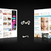
Nike: Nike+ Trash Talk: view
Ads served across a popular men's site and a popular women's site were each used to Trash Talk to the other sex. It's a virtual battle of the sexes.
|
| |
 |
Apple: Mac & Pc: View
This ran on a popular PC web site and is just one in a huge series where Mac & PC battle it out in contextually aware banners. |
| |
 |
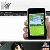
Apple: iPhone: MTV, ESPN, Nylon, Yahoo!
Maybe not as innovative as the other examples here but pure sexy and was a very talked about campaign. Going the extra mile on the media buy and not purchasing standard media is what made this campaign. The sites would have enjoyed both being paid to be seen as innovative and the increase traffic from people passing the sites around to check it out.
|
| |
 |
Nissin: Hot Noodle: view (NSFW)
A hot video that helps cook the noodles on the same page. This video was set up like the Wario example as a special page but in the future we should be able to talk directly to any video served on a portal like this.
|
| |
 |
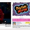
Nintendo: Rhythm Heaven: view1, view 2
It might not be as well executed as the Wario Experience but the purchase of two synced banners on popular Youtube music clips that seem to react to the videos is some interesting thinking.
|
| |
 |
Playstation: Xbox Launch: view
Back in 2002 when the first XBOX launched in Australia Sony was ready and had an online campaign that played on the rivalry of the two consoles and showed Playstation's iconic symbols being spray painted on what looked to be XBOX banners on any page that mentioned the Xbox launch, which at the time was a big news story. Cheeky and well planned.
|
| |
 |
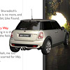
Mini: White Rabbit: view
As the ad states "this is not the way to the Mini site" and it's not. It's a journey through the weird and wonderful web. Media bought across popular and obscure sites took you on a journey as you chase the the White mini (rabbit) down the hole.
This won Gold at Cannes 2007 and as it's 2 years old the ads are no longer active.
|
| |
 |
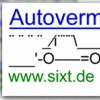
SIXT: ASCII Ads: view
By using ASCII ads in Google Adwords SIXT was able to stand out from the crowd. They also brought forward a ban on this practice too.
|
| |
 |
Lipton: Weather
I'm tracking down examples of this but in an effort to position Ice Tea as a refreshing beverage alternative Lipton Australia bought media on popular news portals on the provision that the ad would only be displayed only if the weather was over 30 degrees (86 Fahrenheit). The same idea was used on radio.
|
| |
 |
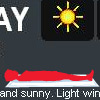
Special K: Sunbathe: view
Another weather related banner that appeared only when it was sunny in Sydney.
|
| |
 |
Honda Insight: Let It Shine: view
This time Vimeo get in on the action with a complete custom media buy with an integrated ad for Honda. Love the sun rise part. Again like the Wario example this shows how working with publishers and planning early can really enhance an online execution.
|
| |
 |
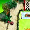
Nintendo: ExciteBots: view
Nintendo again! And this time they have done a deal with Viacom and bought a race track around three major kids portals. Nick, Neopets and Addicting games. This wins the award for biggest and most ambitious attempt.
Check it out live with the link abive while we get an archive link from Struck who created it.
|
| |
It's also worth checking out the Media Gaffes section which has examples of where contextual advertising goes wrong.
What these examples show is that when the media agency put as much effort into being creative as the agency you end up with something greater than the sum of the parts. If you are a client who is sick of getting the same media schedules send this article over and ask them.
Updated 29 April: Added Honda and Excitebots to the list.
If you have any other good examples of online media please submit them to us at submit [at] bannerblog.com.au
|
| |
| If you enjoyed this feature you might also like our features on Sexiest Banner Ads, Crowded Ads, Agency Xmas Cards 2008, 2007 & 2006 the 2008 Election |
