Commbank on Gizmodo
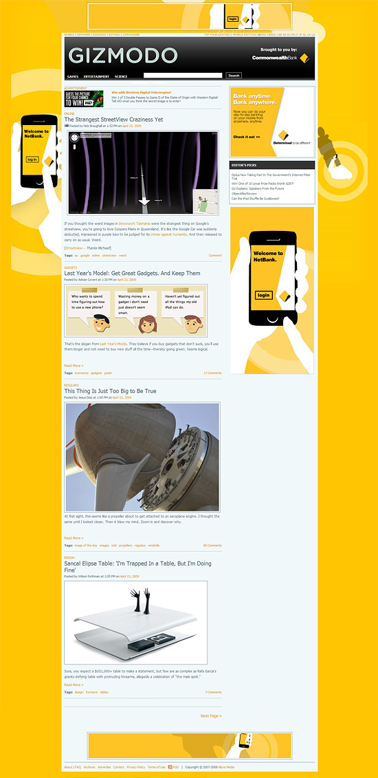
There is a line that can be crossed when advertising/sponsorship on a site just goes to far. Exhibit A from Gizmodo Australia for Commbank is below.

4 banners all showing the same message and animation and the side 300x600 doesn't scroll away on the page. It follows you down the the banner at the bottom. A real wasted opportunity that will just end up annoying the user rather than persuading them.
Client must be thrilled. "BRILLIANT, NO ONE COULD MISS THIS SHIT!" should be the media release.

